A user research project centered the mobile interfaces of
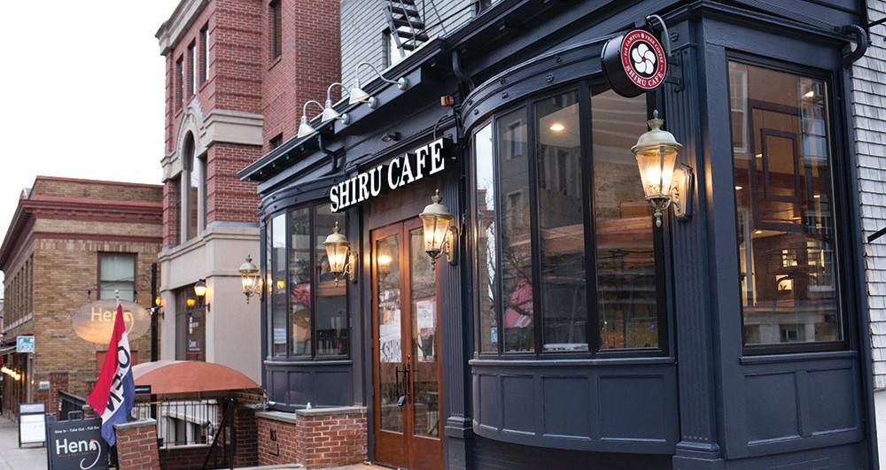
Shiru Cafe in Providence, Rhode Island.
UX research centered around personas, mental models, and UX
principles of learnability, usability, and memorability.
Overview
When the cafe offering a wide array of free drinks to all
Brown University students (to be fair, in exchange for data about
students’ career interests) opened in the Spring of 2018, I was ecstatic.
Free light roasts, free matcha, free hot cocoa? I’m 100% on board.
But getting the drinks requires using an interface on a mobile device,
which can then be scanned. There are certainly design improvements that
could be made to the interface, which served as the initial inspiration
for this project.
To get a clearer sense of the user experience of the
interface, I observed real users interacting with the Shiru Cafe interface,
interviewed individuals about their experiences, constructed maps of users’ mental
models, created personas based on these users, and illustrated a storyboard
for a persona, to develop UX research and design skills.
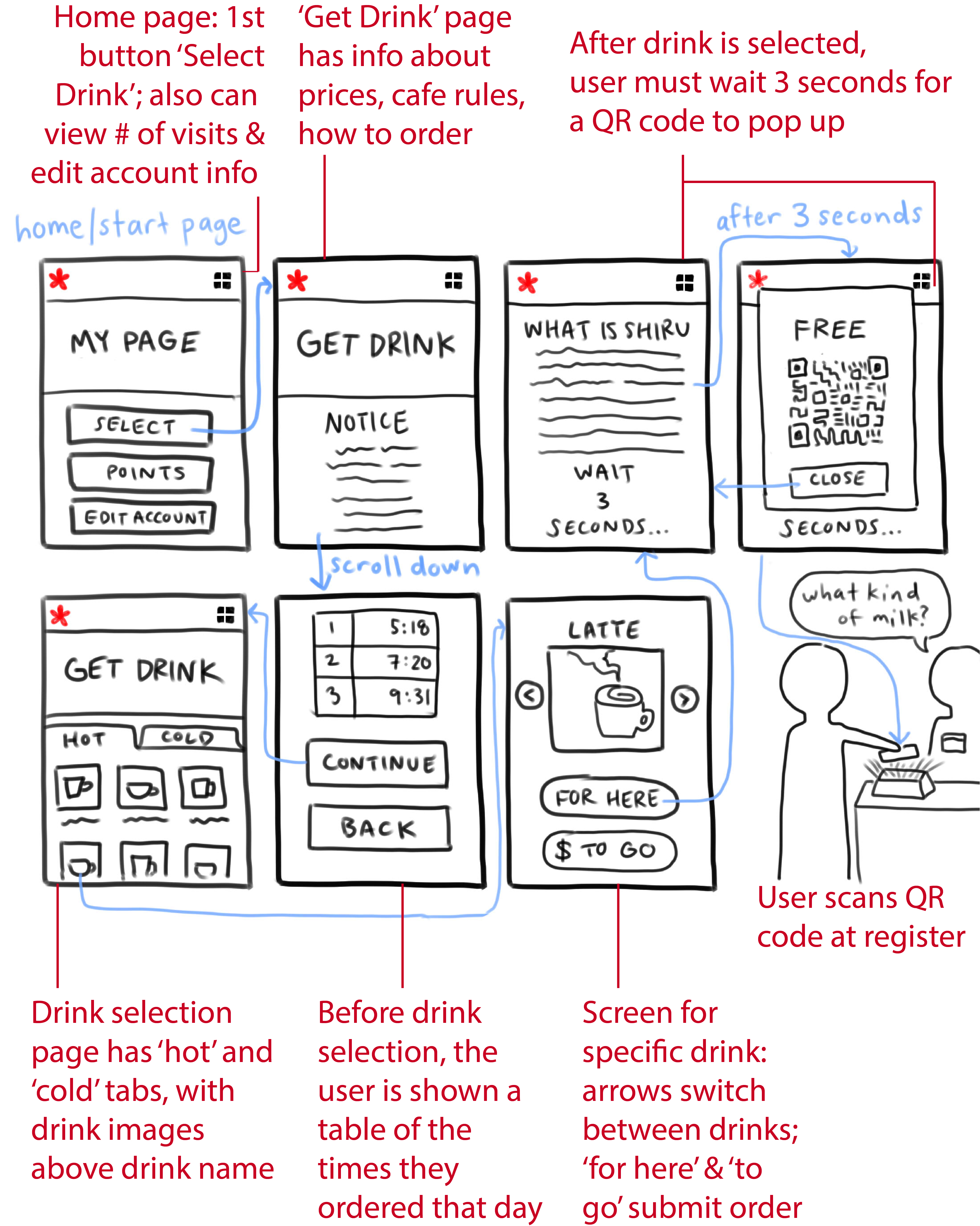
Interface Flow Annotated Sketch
First, I broke down the Shiru Cafe interface and the process of a user
interacting with the interface in an annotated sketch (flow of site in blue, annotations in red):
The (primarily mobile) Shiru Cafe site was designed to allow people to choose a
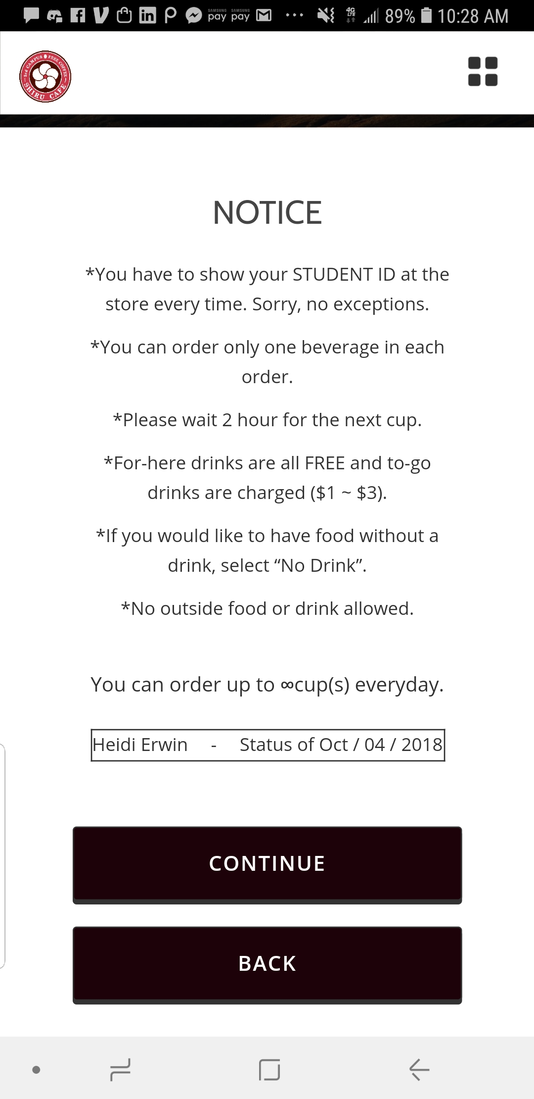
drink and payment option. The user must either read or skip information about
that day’s previous orders and cafe policies to reach the drink selection screen.
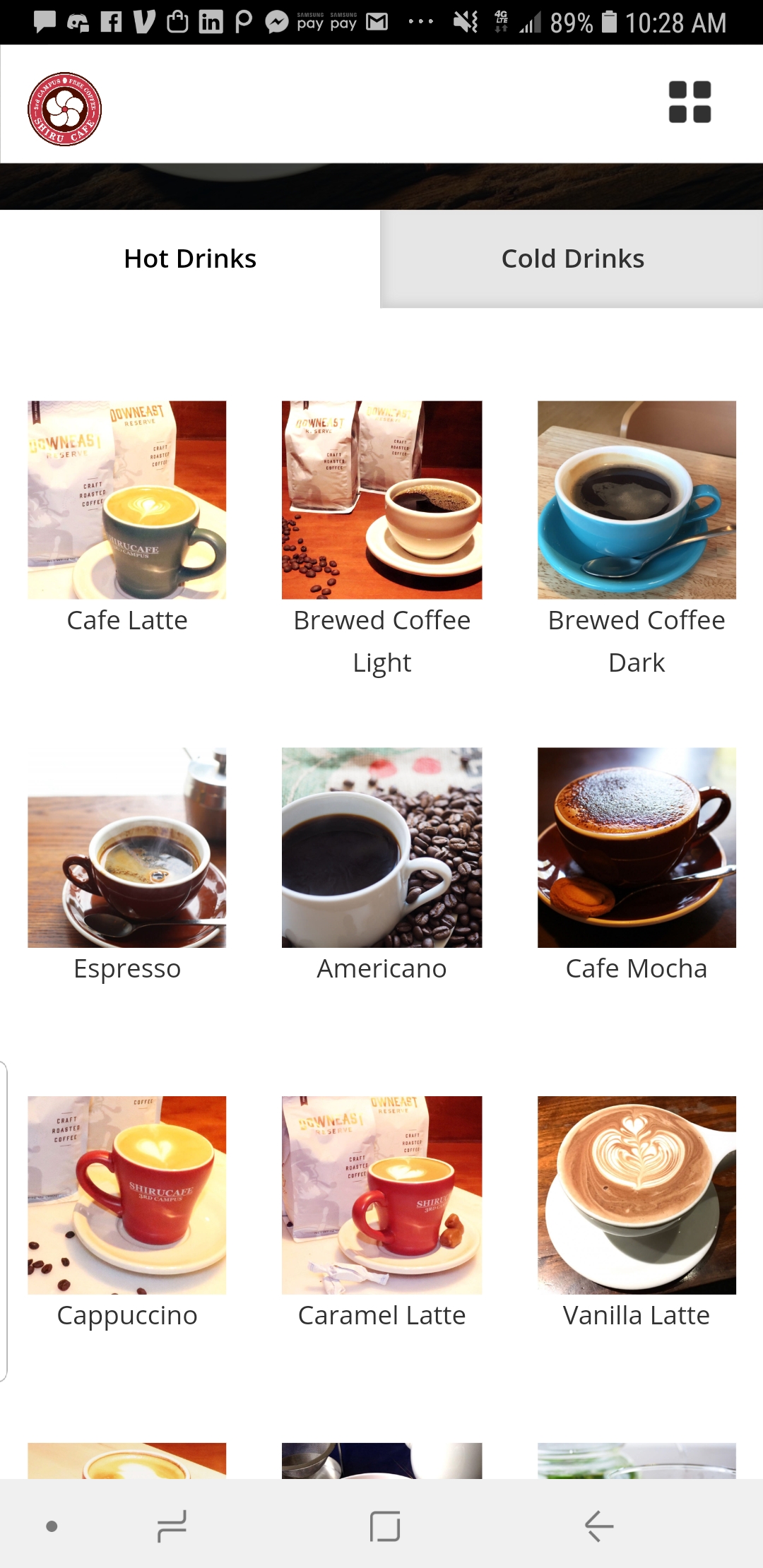
The drink selection screen has ‘hot’ and ‘cold’ tabs, and a grid of clickable drink images.
Once the desired drink is clicked and on screen, the user is able to select between
‘for here’ (drinks consumed in the cafe are free) and ‘to go’ options. Next, a
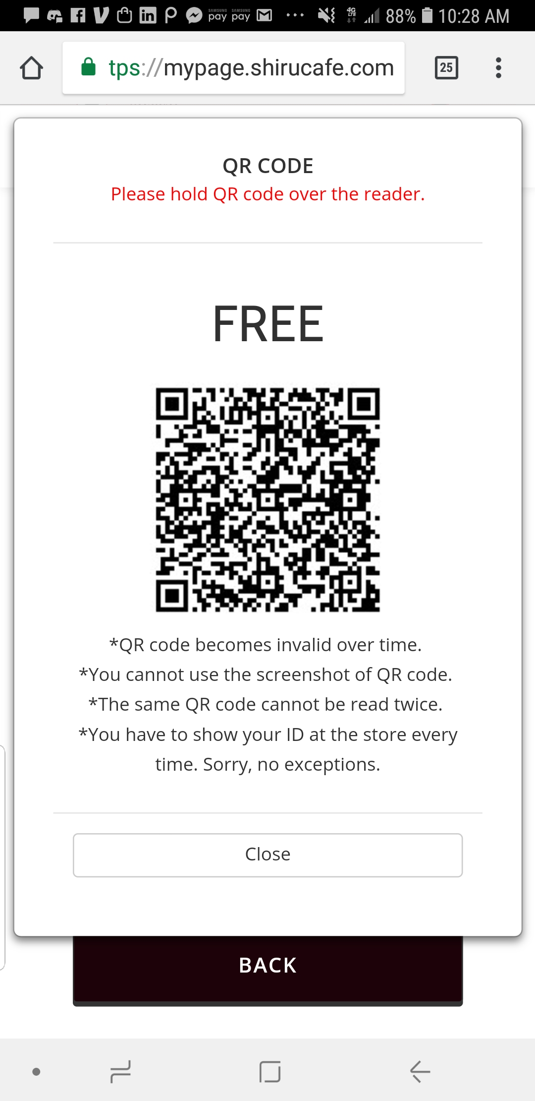
QR code appears after a 3-second wait, to be scanned by a barista.
Observations
I then observed users interacting with the interface in the cafe:
Shiru Cafe is a bit loud, with people chatting with friends and music playing
overhead, though most of the students there are working. Customers enter the cafe
looking at phones, often logging into the site as they approach the front doors.
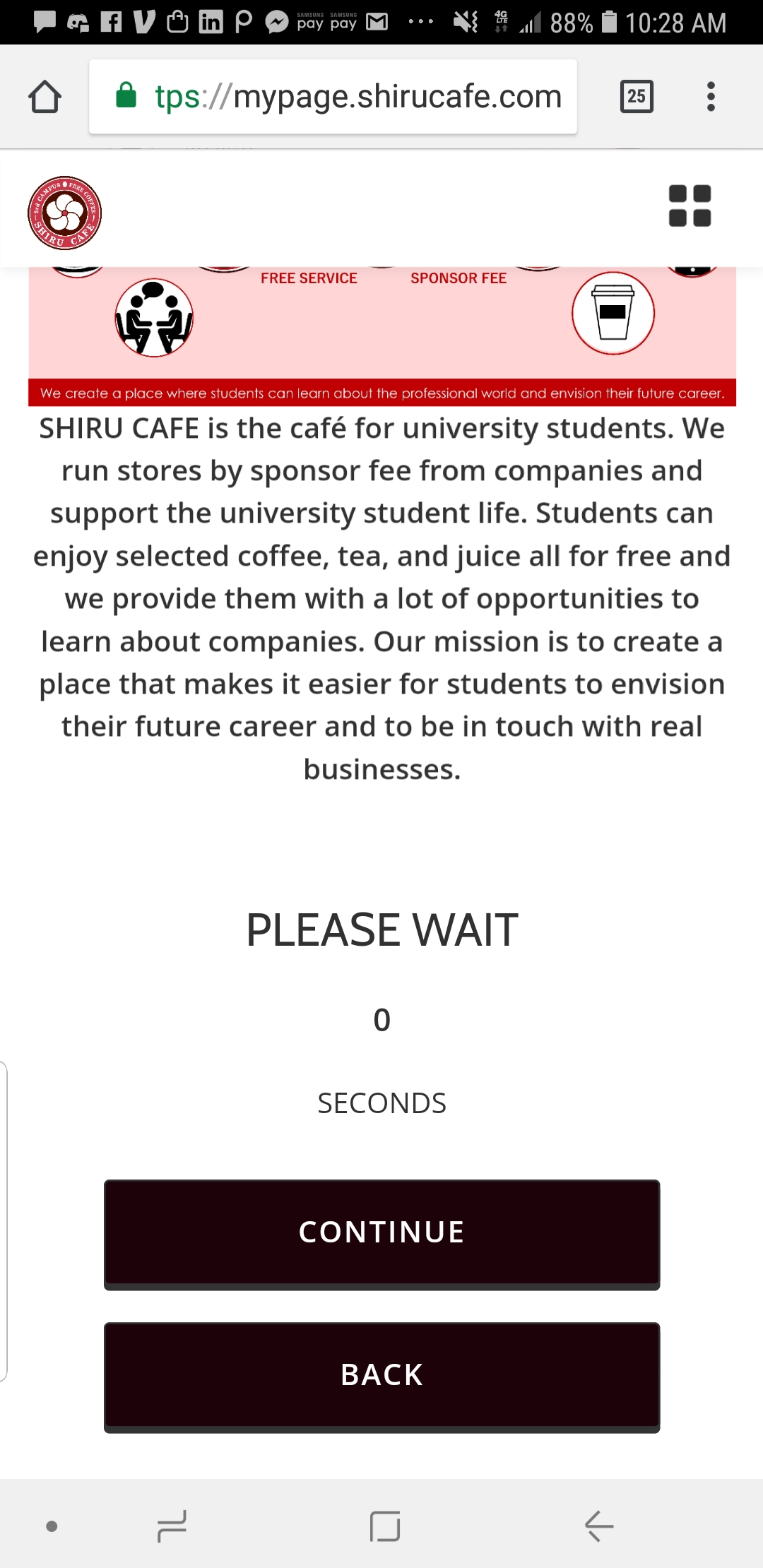
Once logged in, all the users we observed skip past the first informational page
(Figure 1), immediately clicking to get to a screen of drink options with images
(Figure 2). Some users scroll up and down the images, while others jump instantly
to their preferred drink. After the drink is selected, the interface prompts users
to wait 3 seconds (Figure 3) for a QR code (Figure 4), at which point people often
turn up their phone brightness so it can be read by the register’s QR scanner.
Once the code is up, they don’t touch the screen, and users seem a bit flustered
if their QR code hasn’t yet loaded when it’s their turn to scan.
Interviews
Next, I pulled six people aside to interview them about their experience interacting
with the interface. Some of the observations, along with interview responses of two
interviewees (names changed to “Alice” and “Bob” for privacy) are below:
“What pain points have you experienced with the site?”
Alice mentioned the 3-second loading period, and Bob said it was “fine.” For him,
the site was good enough, but he brought up the annoyance of re-logging in each visit.
“What do you think of the buttons on the Drink Confirmation page?” (See Figure A)
Both of them felt that the buttons and their symbols were clear, but Bob wished they
were larger. No one we spoke to utilized the arrow buttons to navigate between drinks,
instead preferring to go back to the grid of all the drinks and reselect there.
“How do you feel about the drink images?”
Both responded that they did use the drink images, though Bob mentioned that he’d
like to see more information: calories, sugar content, milk options available.
“After picking your drink, what other information do you tell the server at the counter?”
Both said they give milk/sugar preferences, as the site doesn’t have this option.
“When do you order drinks ‘for here’ vs. ‘to go’?”
Bob responded that he got drinks to go if the cafe was crowded, which was the case
when we interviewed him. Alice said that she always ordered drinks ‘for here’ so she
could eat her lunch with her drink, and get some work done.
“Which drinks do you order most often?”
Bob quickly responded with “matcha latte or hazelnut latte,” and Alice responded
similarly promptly with “matcha latte or caramel latte.” Both people seemed to have
go-to drinks that they ordered consistently.
“What do you usually do at Shiru?”
Bob responded that it was too noisy to do work, so he would usually drink his order
and then leave, but if he saw a friend, he would always sit and chat with them. Alice
usually tried to get work done in Shiru, often multitasking and eating lunch, too.
Personas & Mental Models
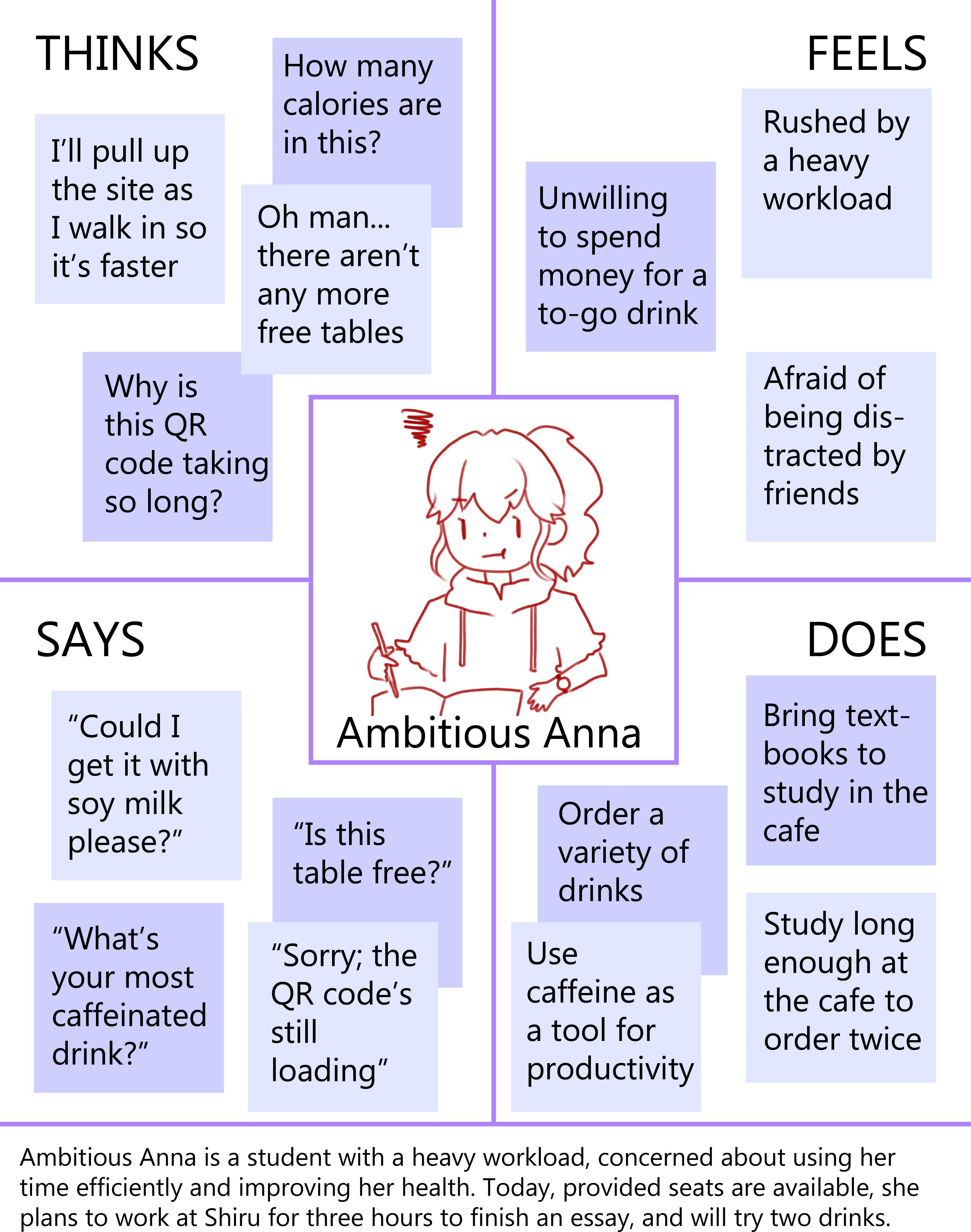
The next step in the project was creating two personas, Silas and Anna,
and their mental models, to examine the user experience of the interface.
Anna’s Mental Model:
Anna expects the app to be efficient, with minimal screens and navigation
as the cafe is full of students and lines can be long. She’s also familiar with LaundryView,
a site that shows which campus laundry machines are free, and anticipates a similar feature
that shows which tables at Shiru are open, because customers must pay to get drinks to go,
which they’re forced to do if they can’t sit down.
When Anna arrives at Shiru and the seats are full, she feels irritated that she walked
there for nothing, as she is unwilling to spend money at the cafe. She expected the app to
be efficient, so her first couple visits she opened the site too late, and held up
the line as her code loaded. As she began visiting more, though, she started to
anticipate a series of several clicks to order a drink, and began loading the site before entering Shiru.
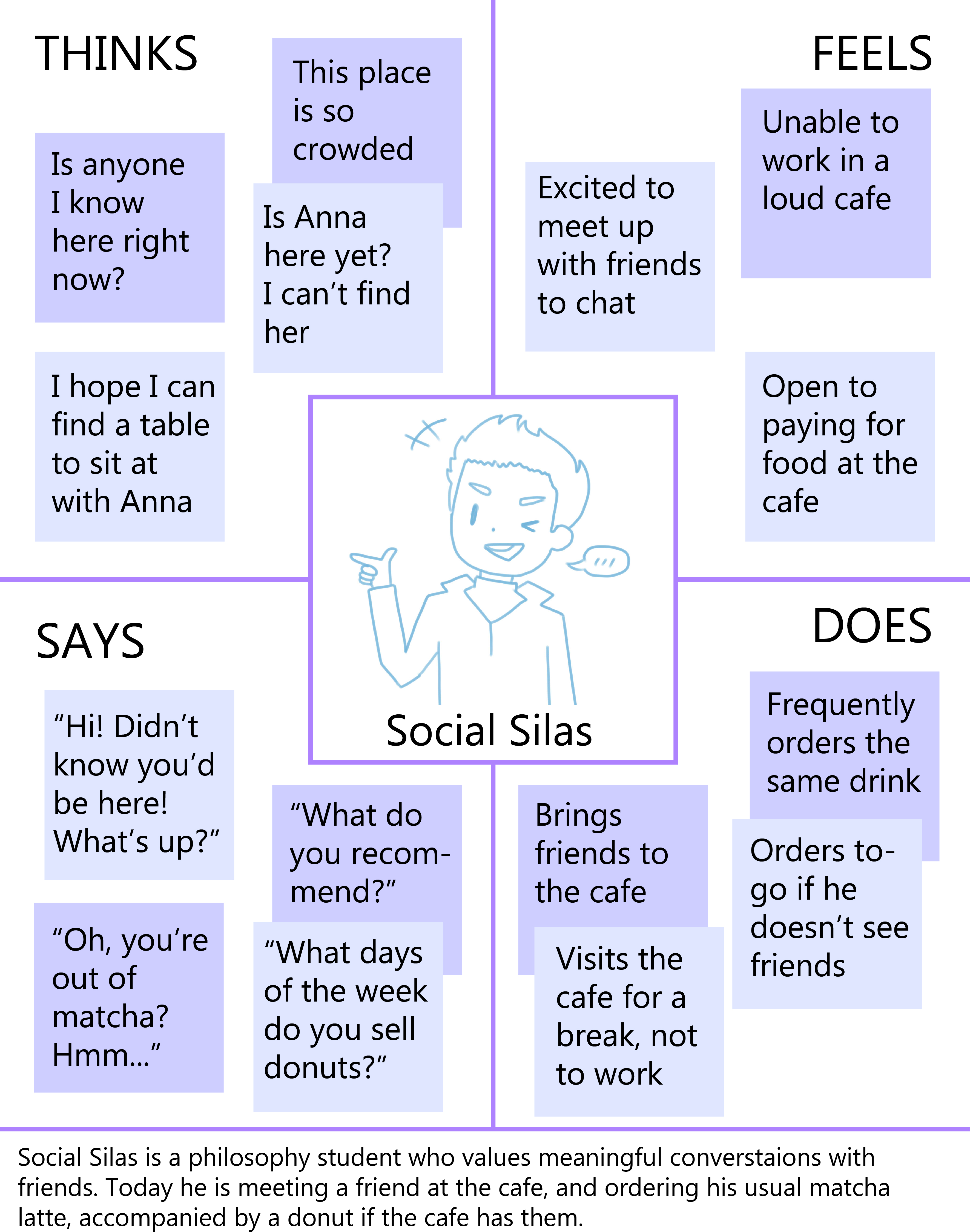
Silas' Mental Model:
Silas, an avid social media user, is accustomed to cafes like Starbucks,
and expects an interface that will remember what he wants to order and show prices,
with options to re-order the most recent order and view trending drinks. Also because
of other app-ordering experiences (e.g. SnackPass), he wants all food and modifications
to orders, to be accessible on the site, alongside a possible social option to see if
friends have checked in (like Yelp and Snackpass).
The app doesn’t indicate when ingredients are gone, so Silas is flustered and
must think on the spot when the barista says they can’t make the drink indicated
by his QR code. He’s disappointed that he can’t view food items on the site (as one
can with Starbucks or SnackPass), so he checks the pastry display upon arrival and
often leaves Shiru caffeinated, but still hungry.
Reflections
This was a great opportunity for me to get some practice utilizing personas,
a methodology common in the field of UX design and research. Were I to take
this project further, I would conduct a couple more interviews with a more
diverse and representative sample, and ultimately move on to prototyping a
new interface and conducting user testing.
This project was also an affirmation of all of the insights on user experience
that can only be gained by learning about the users of those interfaces and
the contexts of these interactions.
"People ignore design that ignores people."
—Frank Chimero, Designer