WHEN: October 2018
WHAT: UX Design, Prototyping, User Testing, Figma
A group project centered around designing a user interface from scratch based on a description of a startup
without knowledge of the company’s intended interface, and then testing
this interface using eyetracking.
For the course
User Interfaces and User Experience at Brown University.
In collaboration with
Christopher Nivera,
Gregory Dahl, and
Justin Chen.
Check out the high-fidelity prototpye
here!
What is #ME?
We decided to design an interface for the startup #ME.
#ME is an avatar-based social network empowering people to develop
their identity in any way they want. They’re committed to providing
a welcoming environment for people from all walks of life. We
selected to design a mobile interface, as #ME is intended to be
engaged with on the go.
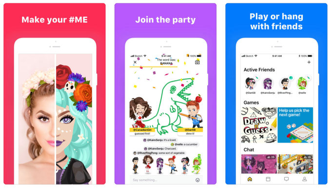
Some of #ME’s original thumbnails as posted on the App Store:
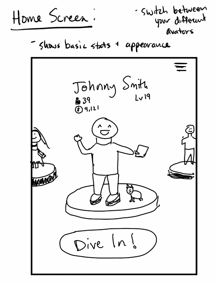
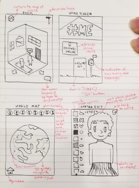
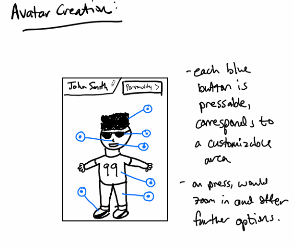
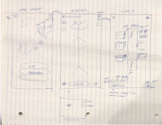
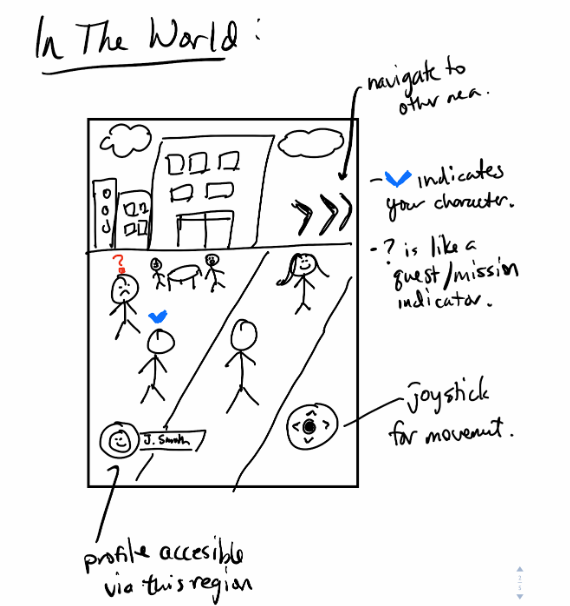
Sketching
Knowing that we wouldn’t be able to come up with a solid design in
one go, we started with the fundamentals — sketching. Through sketching,
we could each individually come up with our visions of the app,
draw them on paper, and compare ideas. The differences between our
designs helped us share perspectives and ideas that we might not
have thought of individually.
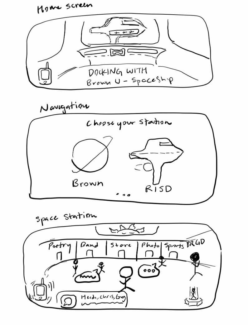
After sketching, the group came together and decided on which
direction to go. Although the designs of our hi-fi prototype are
a mix of all of the designs, we agreed that the space-themed design
illustrated in one of the sketches was a unique take on #ME’s mission.
Focused around a sense of a community and exploration, a space-focused
#ME would align with the fact that #ME is made for people to express
themselves in avenues they would not necessarily in real life.
Users can make their avatars as wild as they want, partake in
fantastical games, and meet people from across the world.
High-Fidelity Prototype
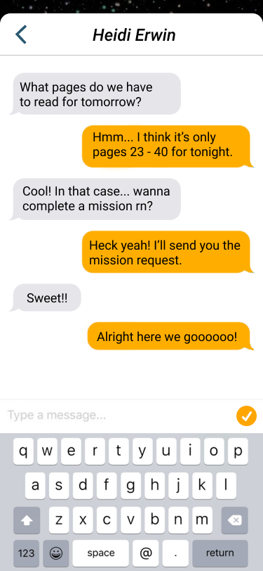
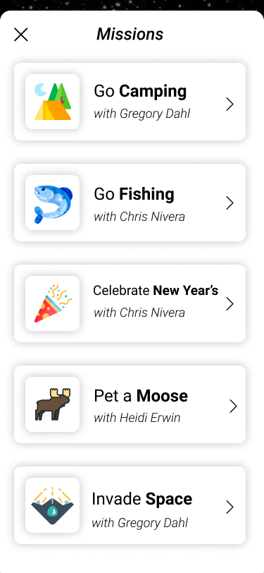
Our next step was to consolidate these sketches and create a
hi-fi prototype
for testing using
Figma. Feel free to play around with it yourself
here!
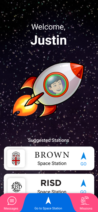
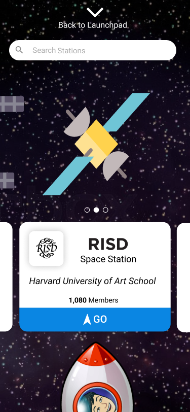
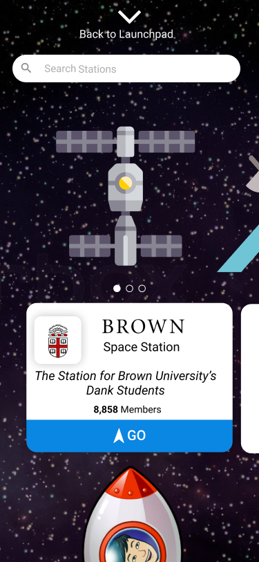
With regards to the home screen, we imagined users traveling in their
spaceship to different “space stations” (communities), in order to
find other “space travelers” (friends), mainly drawing inspiration
from the isometric house and personal ship sketches. Because self-expression
is a priority for us, we placed the spaceship with the avatar at the center,
hinting at its clickability with a green halo affordance.
Listed below the ship are geographically close space stations. Additionally,
to bolster both learnability and memorability, we use a combination of icons
and text to provide visual recognition and ease of first use.
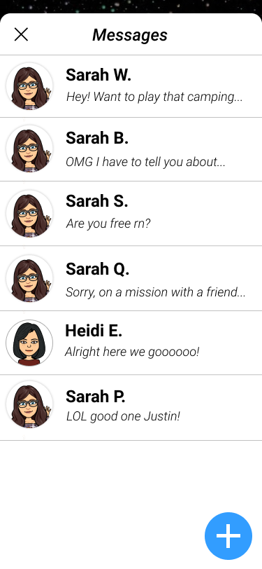
One of the most important aspects of using #ME is actually exploring the world
and interacting with other players. We decided to design the space station/house
screen by combining what all of us felt was important in displaying a “virtual
community”. We did not want the actions to feel foreign to the user,
so we kept some very standard features – for example, player avatars can be
clicked to view a player profile through which messages/friend requests can
be sent. Additionally, viewing a friend’s profile shows relevant information
about the relationship between you and your friend. Being able to display,
physically, the friendship between you and another user was important to
fostering a sense of community.
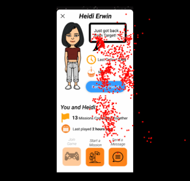
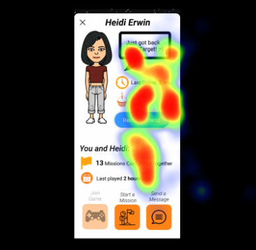
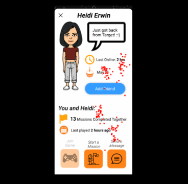
Eyetracking
For this project, we were very fortunate in that we were able to
utilize an eye tracker, as part of a session with a user in order
to further understand how users interact with our prototype. Using
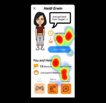
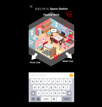
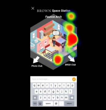
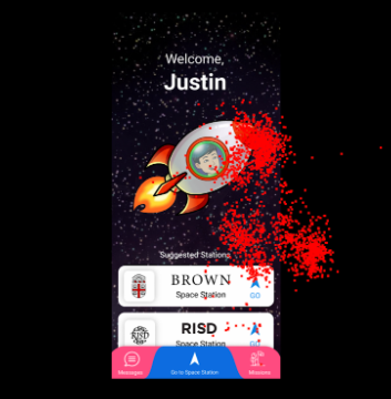
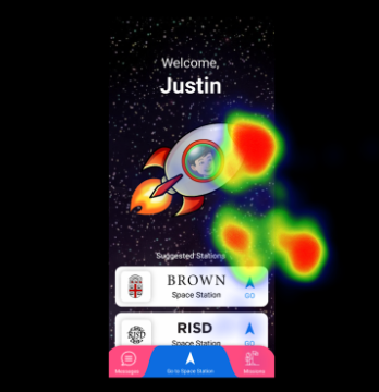
Python, we generated heatmaps, which depicts where the participant’s
gaze was fixed, and animated replays of the participant’s gaze motion
on each screen. The code for the visualization can be accessed here,
but some screenshots. The screenshots with the red dots
are the finished results of the replay animations, and the multi-colored screenshots are the heatmaps.
Reflections
The Iterative Design project was a great experience in collaborating with
others in the UI/UX field. I gained a grasp on the full design process,
from barebone sketching to high-fidelity prototyping. As a designer, it was
exciting to integrate many of the different design principles from class
into a single final product.
I’m also grateful for the opportunity to utilize eye-tracking technology;
combining design with data collection and visualization offered new perspectives.
Were we to take this project further, our next step would be to actually
fully program the app using a language like React or Swift – but for now,
that is job for the original #ME team!
