WHEN: October 2018
WHAT: HTML/CSS, UX Design, Prototyping, Photoshop
A responsive (desktop, tablet, mobile and 4K) redesign of Double Fine
Productions’ website integrating UX principles of learnability, usability,
and memorability.
View the Github repository for the project
here!
Goals & Original Site Design Analysis
My goal was to experiment with simplicity and more modern, minimalist
styles that would aid in intuitive navigation of the site. The
current site is cluttered and outdated, which is understandable for an
indie game studio without a huge focus on web development.
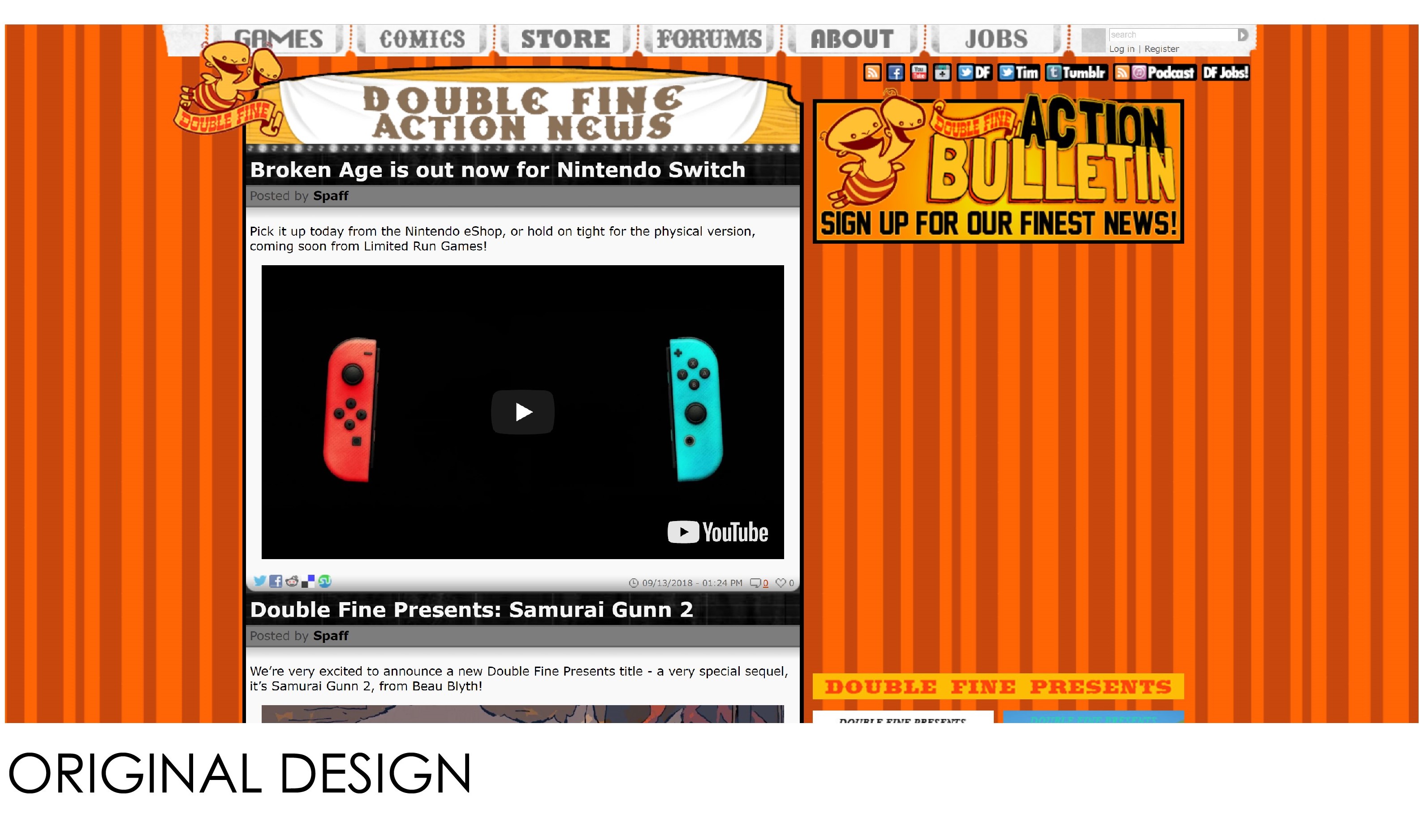
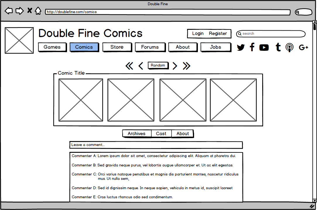
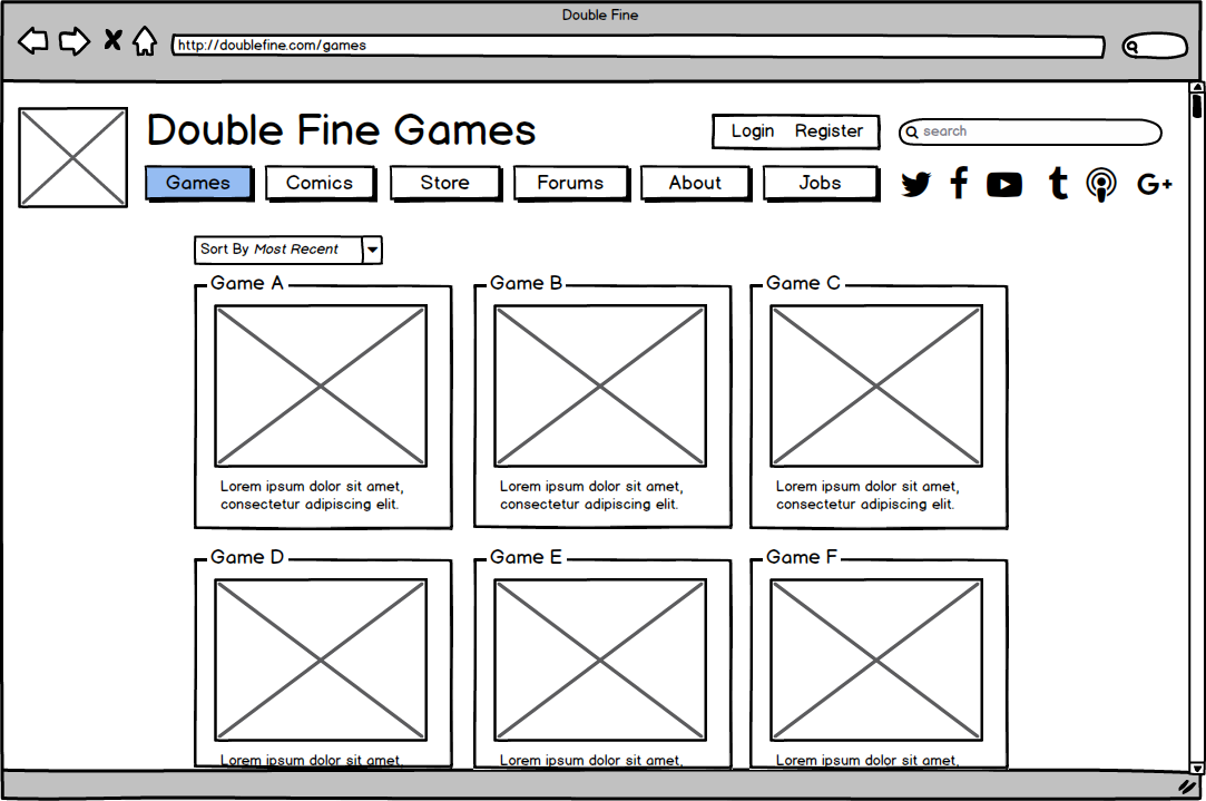
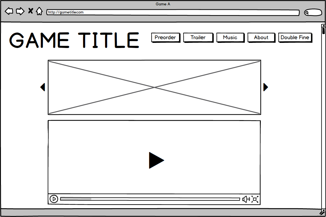
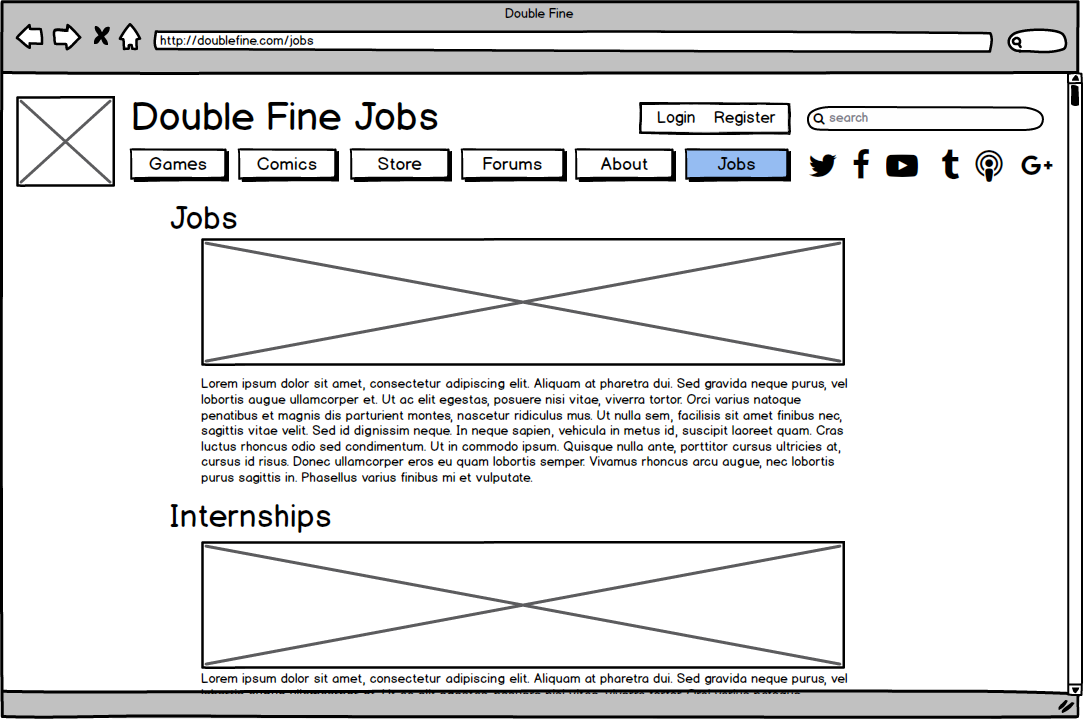
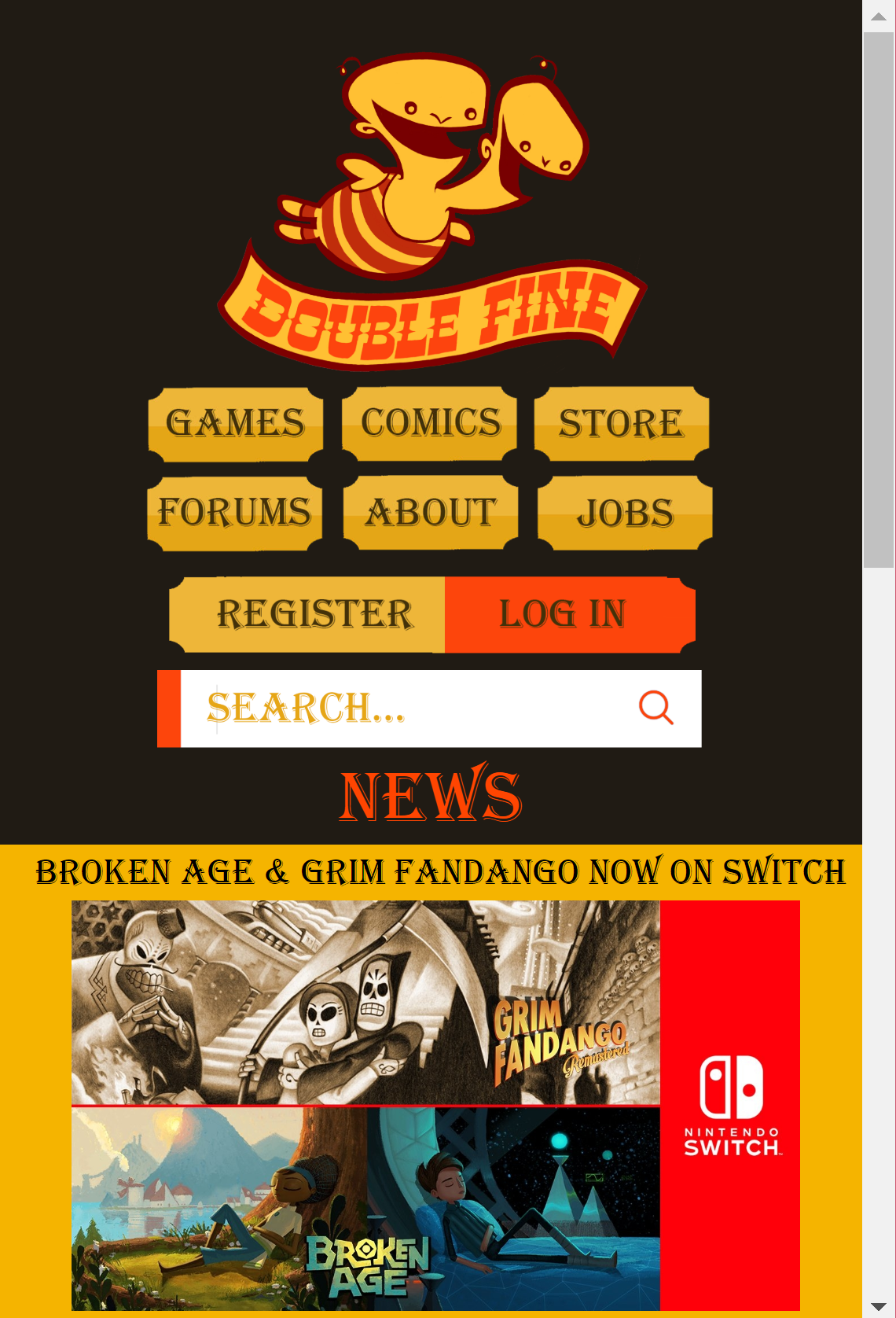
Below is the current site for Double Fine Productions, a video game
company that has sold millions of copies of several games including Grim
Fandango and Broken Age. The Home page is primarily announcements, with
several menu tabs at the top indicating different sections of the site.
Photos of games and comics are on the right side.
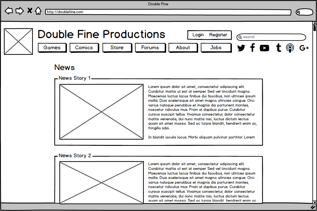
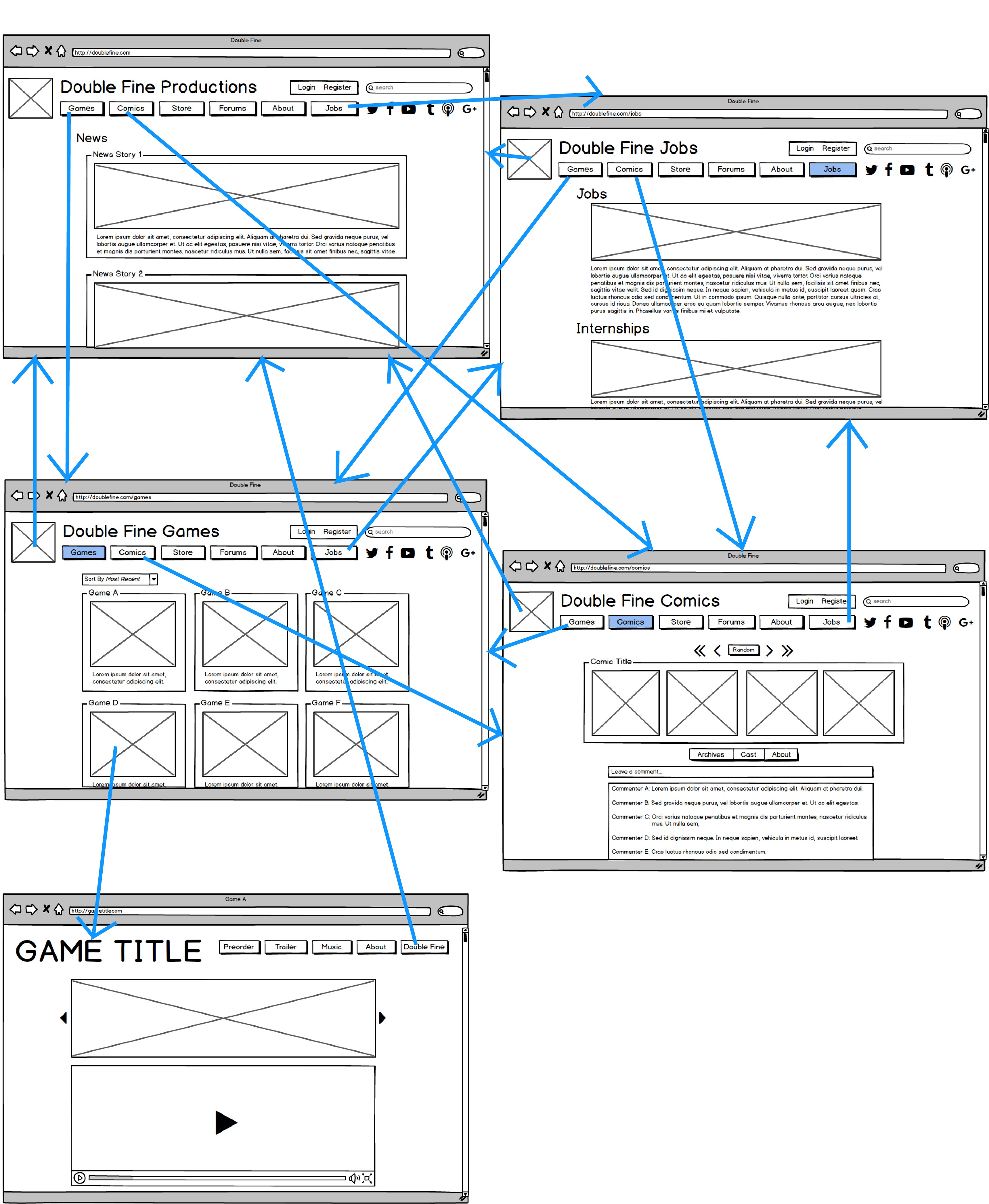
Wireframes / Usability Redesign
I first created five low-fidelity wireframes in
Balsamiq to increase the usability of Double Fine’s site.
The navigation flow between these wireframes is shown below:
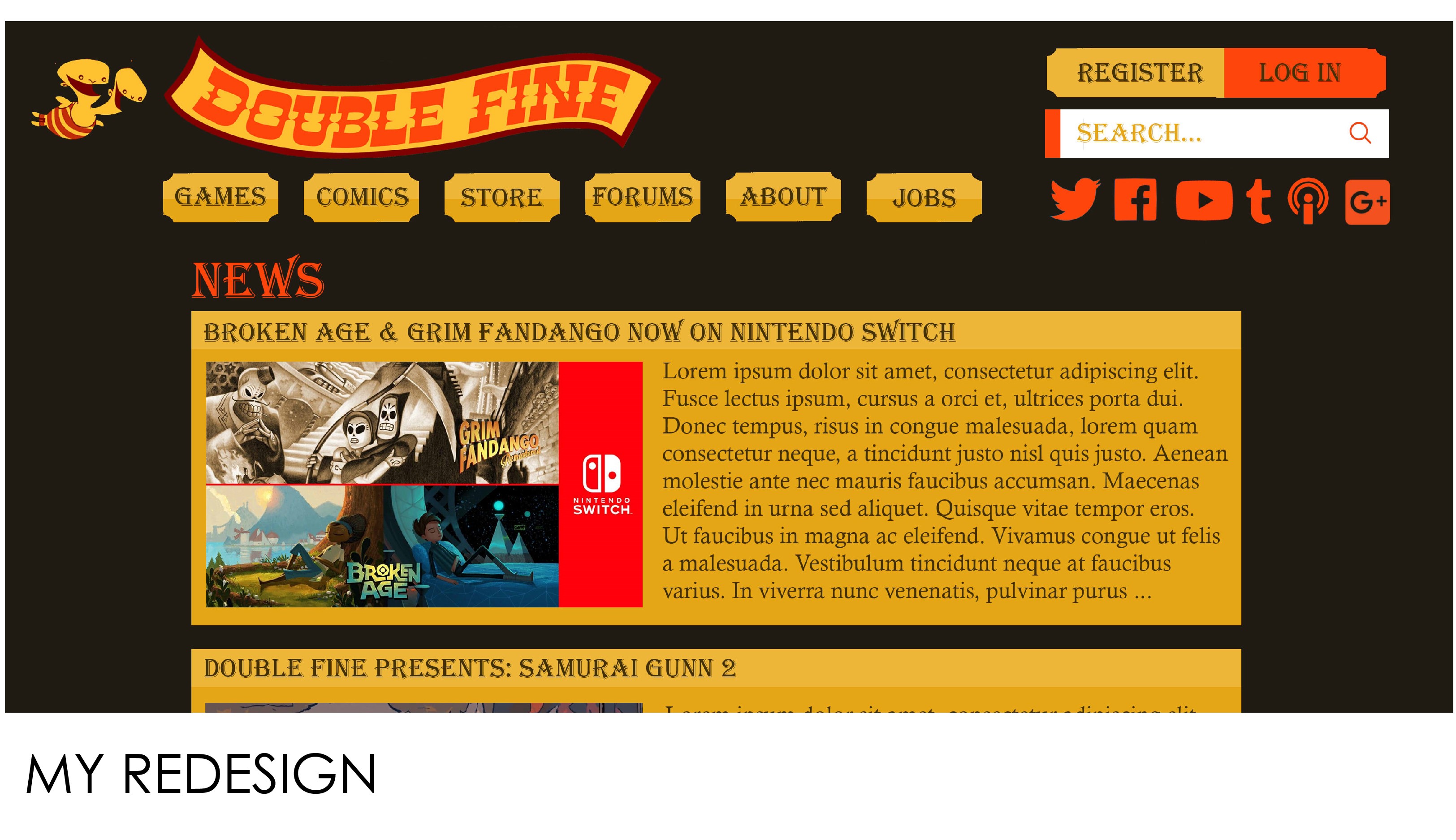
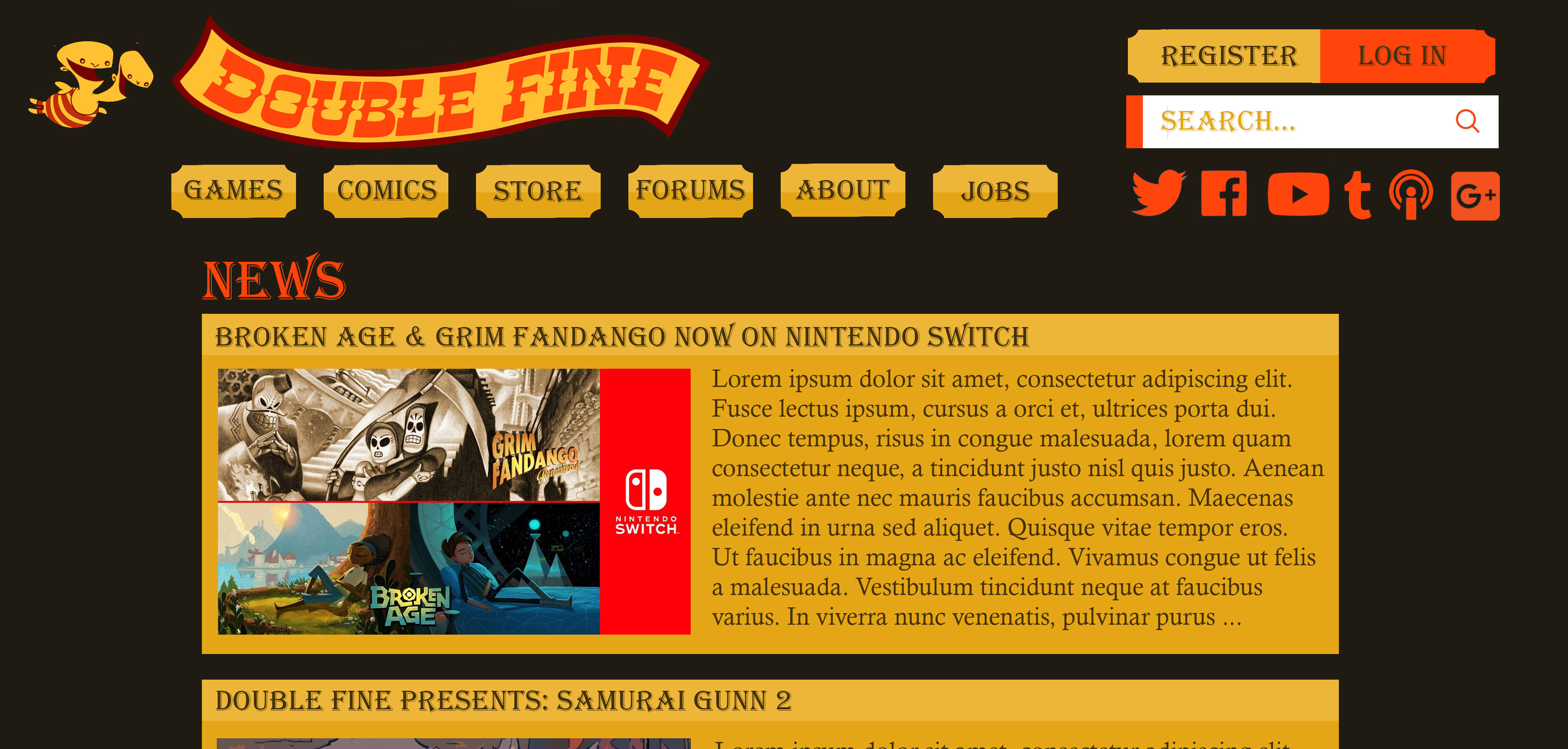
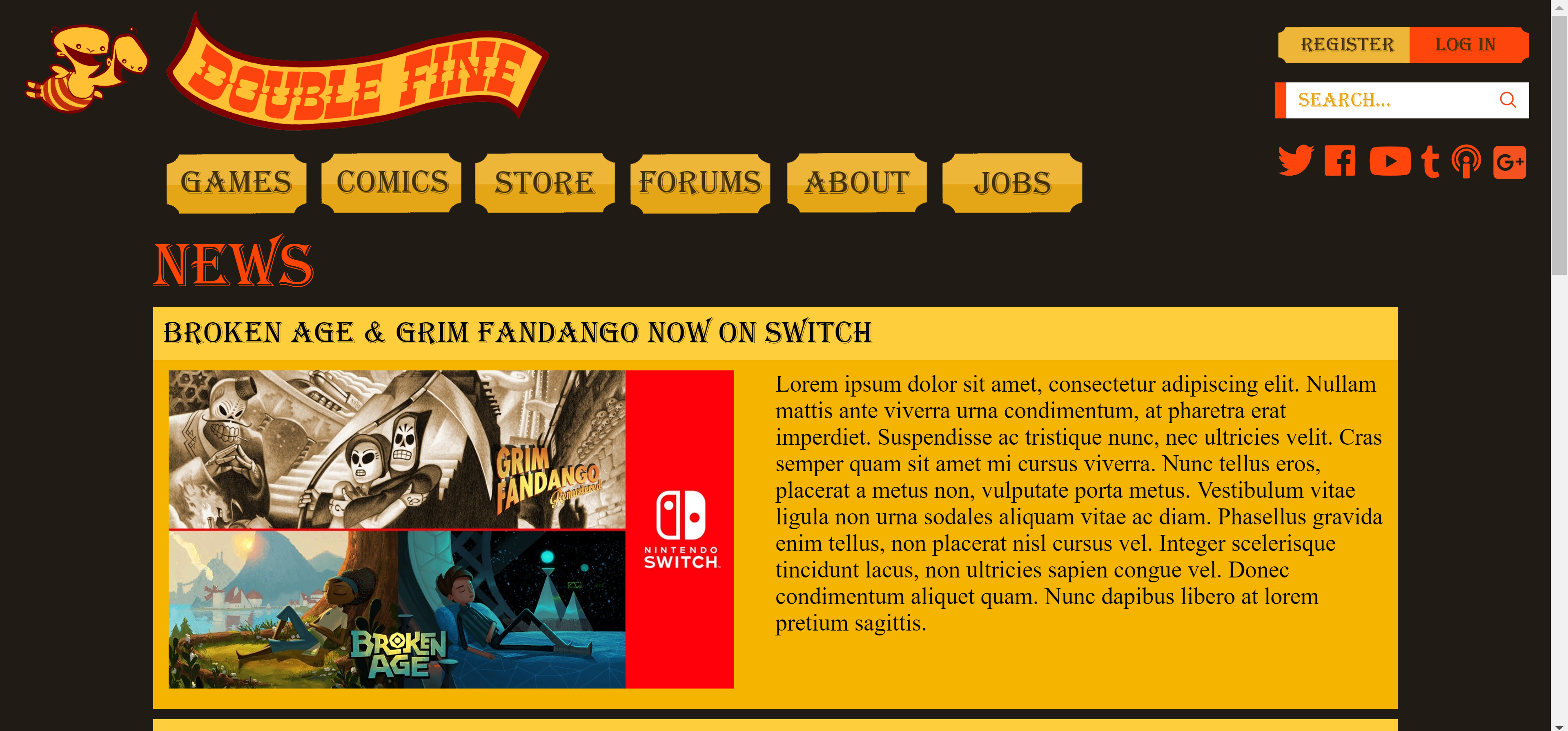
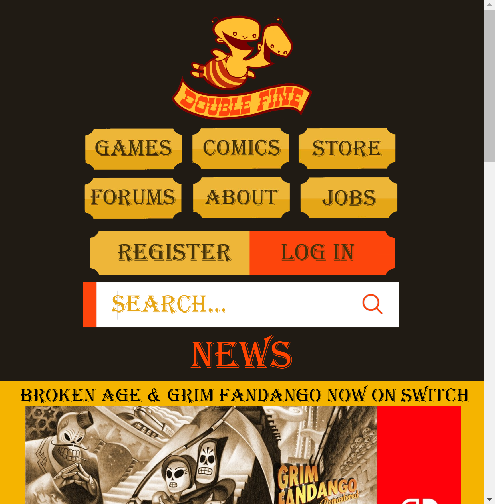
High-Fidelity Mockup / Visual Redesign
After wireframing, I used Photoshop to create a high-fidelity mockup of
a new Double Fine site.
Double Fine’s original color scheme has been preserved, but the original
background of uneven stripes, which distracted from the main content of
the page, has been replaced with a clean dark brown that
allows interactable and featured elements on the page to
stand out.
Overall, the redesign is much more minimalist, minimizing bright
distractions from the site.
The news articles are now separated, graphically presented as separate
yellow boxes to aid the user in comfortably discriminating which images
and text accompany which article.
The two-headed logo at the top left is now no longer blocking any
buttons or titles, enhancing readability of the site and
reducing user misclick errors. The News section is indented from
the menu to imply a hierarchy and distinguish menu from page.
The original website navigation tabs don’t employ
font consistency, so I’ve chosen a single font for tabs/titles
and a single font for text.
The social media icons have also been made more visible. Duplicate
buttons (e.g. ‘Jobs’ appearing in two places at the top) have been
removed to avoid user confusion and enhance simplicity.
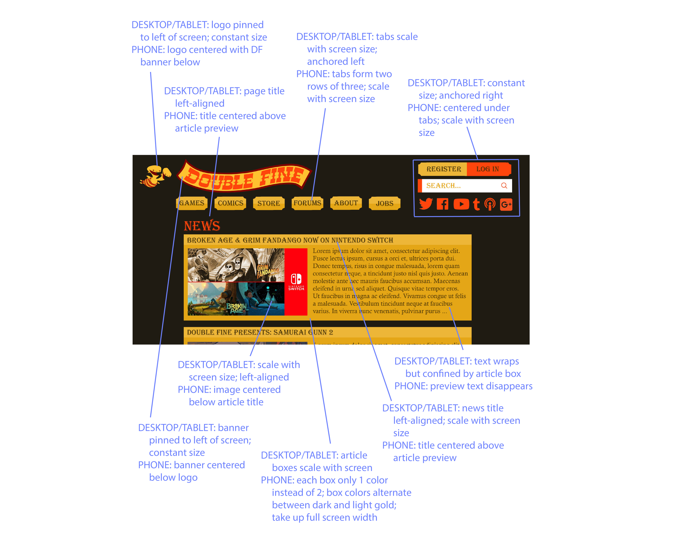
Mobile, Tablet & Desktop Sites / Responsive Redesign
The next step in the project was using HTML and CSS to create a site
whose usability and visual appeal was maintained across different screen
sizes. To create a map of how elements on the screen should adapt to
different screen sizes, I first created the annotated mockup below:
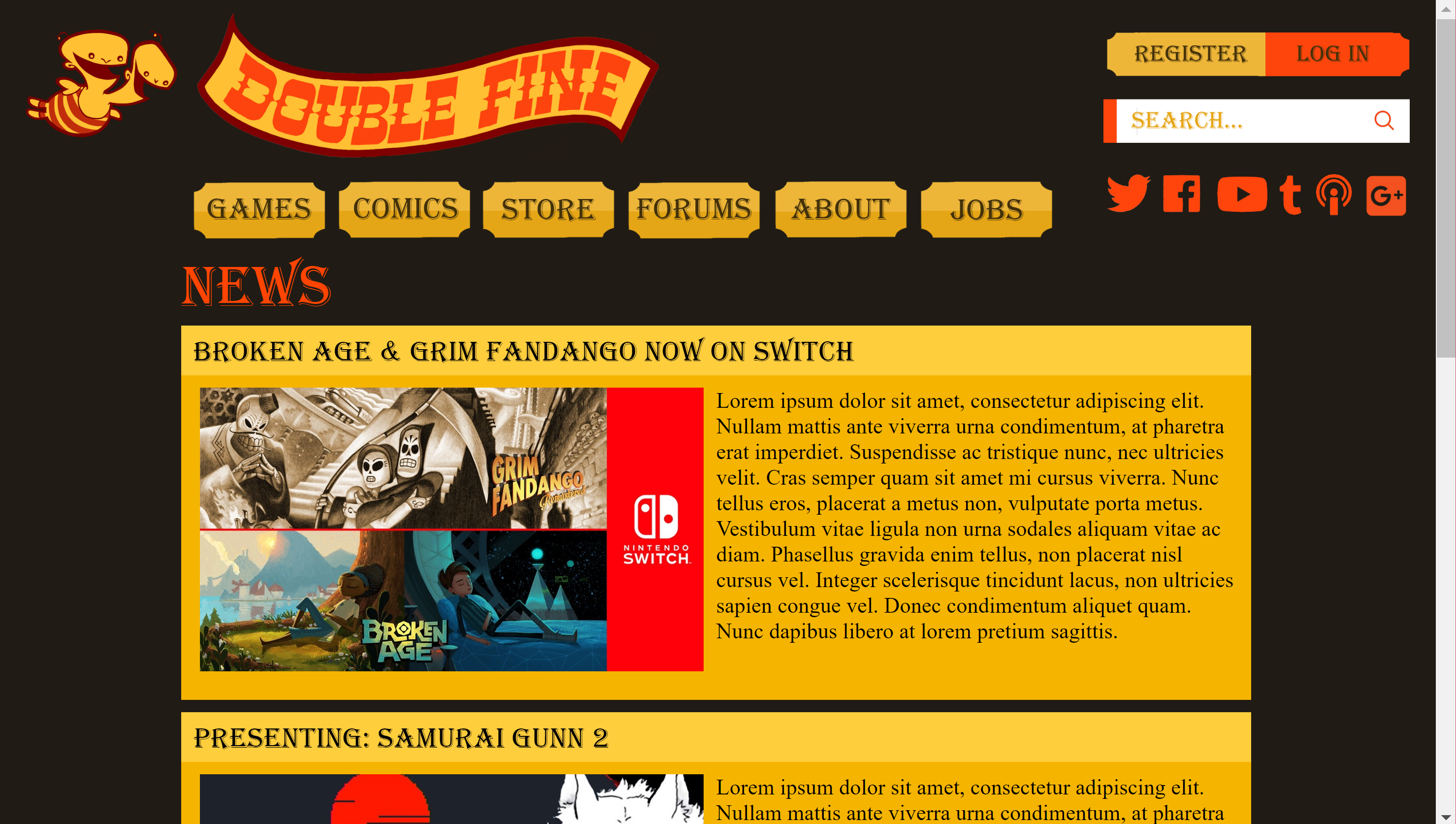
I then used HTML and CSS to create a responsive page whose layout
changes with screen size.
Standard Desktop & Mobile (in Portrait) Interfaces:
4K Screen & Tablet (in Portrait) Interfaces:
The mobile site has been changed to be more similar to scrolling sites
like Instagram: the image and the title are the only two elements in the
News preview (article text preview has been removed) to
reduce clutter and give a simpler mobile aesthetic.
If the user wants to read the article, they’ll click the image (much
like Youtube’s interface).
Text scales according to screen size (but becomes slightly
proportionally larger on mobile) to enhance readability across devices.
The logo on desktop sites is stuck to the top left, alongside the
banner, to serve as a
consistent means of accessing the home page. Similarly, on
mobile, the banner shifts to just below the logo for a centered
appearance. Register and login buttons, along with the search bar and
social media icons are also stuck to the right on desktop for
easy and consistent access. On mobile, these elements are placed
just below the navigation tabs so they’re visible.
Contact info is often found at the bottom of mobile sites, so the social
media icons have been moved to the bottom in the mobile layout. Overall,
the mobile site is simpler, including news articles just using one color
for both title and image, with backgrounds of consecutive articles
alternating colors to help the user distinguish between articles.
Reflections
Were I to take this project further, I would add responsiveness to the
other pages of the site, including creating distinct game pages for each
of Double Fine’s games. Overall, though, this project provided me with
an opportunity to
design a site whose layout adjusts for different screen sizes,
and allowed me to apply my design skills, accounting for both
usability and aesthetics, to a real game company.